How Consultant Websites Convert Clients: 2026 Guide
How Consultant Websites Convert Clients: 2026 Guide

A high-converting consultant website is defined by three things: clear expertise communication, compelling proof of results, and low-friction next steps. Understanding how consultant websites convert clients means recognizing that your site is not a digital business card. It is a sales system that works while you sleep. Tools like case studies, outcome-focused service pages, and free discovery call offers are the structural elements that separate sites that generate inquiries from those that generate silence. Radiant Templates research confirms that case studies drive the highest engagement and conversions on consulting sites in 2026.
What are the essential website elements that drive client conversion for consultants?
Conversion on a consulting website depends on five core structural elements. Each one serves a specific role in moving a visitor from curious to committed.
- Outcome-focused service pages. Clients respond better when they can see exactly what to expect, the results they will get, and who the service is designed for. A service page that lists deliverables without naming outcomes is a missed opportunity.
- A specific About page. Consulting clients buy the person before the service. Your About page must highlight specific expertise, industries served, and credentials with real detail. Detailed background with measurable experience outperforms vague phrases like “decades of experience” every time.
- Case studies. These are your strongest conversion asset. A well-built case study shows a real client situation, the challenge they faced, your approach, and the measurable result. That narrative creates conviction.
- Testimonials and trust signals. Client logos, written testimonials, and recognizable affiliations reduce the perceived risk of hiring you. Social proof integrated naturally supports the buying decision of high-consideration clients.
- A clear, easy contact or booking option. If a visitor has to hunt for your email or fill out a five-field form, you lose them. One visible, low-friction contact path is enough.
Pro Tip: Place your primary call to action above the fold on every major page. Visitors should never scroll to find out how to reach you.
The combination of these five elements creates a site that answers the three questions every consulting prospect asks: Can this person help me? Have they done it before? How do I start?

Why are case studies the highest-impact conversion elements on consulting websites?
Case studies are the top converting element on consulting websites in 2026, outperforming service pages and About pages. The reason is psychological. Consulting is a high-stakes purchase. Clients are not buying a product they can return. They are committing budget and trust to a person. Case studies reduce that perceived risk by showing proof of a repeatable process.
A real case study is not a testimonial or a project description. It follows a specific structure:
- Situation. Describe the client’s context and what was at stake before they hired you.
- Challenge. Name the specific problem or obstacle they faced.
- Approach. Explain what you did, step by step, without vague language.
- Result. State the measurable outcome. Numbers, timelines, and percentages are far more convincing than adjectives.
“Real case studies involve detailed narratives of client situations, challenges, specific consulting approaches, and measured impacts rather than vague descriptions or testimonials.” — Radiant Templates, 2026
The difference between a case study and a testimonial is specificity. A testimonial says “Working with Jane was transformative.” A case study says “Jane’s client reduced onboarding time by 40% in 90 days using a restructured intake process.” One creates a feeling. The other creates conviction.
Consultants often skip case studies because they feel uncomfortable sharing client details. The fix is simple: anonymize the client, keep the numbers, and get written permission for the narrative. The specificity of the result matters far more than the client’s name.
How to design your consulting website as an asynchronous sales system
Consulting is a high-consideration purchase requiring multiple visits before a prospect books. Visitors often return to your site over weeks or months before they reach out. That means your site must deliver value on every visit, not just the first one.
An asynchronous sales system is a website structured to nurture leads without you being present. It provides useful content, builds trust over time, and keeps prospects engaged until they are ready to commit. Here is how to build one:
- Publish useful content regularly. Blog posts, guides, and frameworks that address your ideal client’s problems keep visitors returning. A content strategy built around client pain points gives your site a reason to be revisited.
- Offer downloadable resources. A free diagnostic tool, a checklist, or a one-page framework gives visitors something tangible. It also lets you demonstrate expertise before any money changes hands.
- Use low-commitment calls to action. The most effective next steps on consulting sites are free discovery calls, downloadable frameworks, or short assessments. These give uncertain visitors a reason to stay connected.
- Reduce friction at every step. Remove unnecessary form fields. Use a scheduling tool like Calendly so prospects can book without a back-and-forth email chain. Make the path from “interested” to “booked” as short as possible.
- Add interactive elements. A short quiz or a self-assessment tool keeps visitors engaged and helps them self-qualify. It also gives you data about what your prospects care about most.
Pro Tip: Add a short email sequence triggered by your free resource download. Three to five emails over two weeks that deliver genuine value will convert more leads than any homepage redesign.
The goal is a site that works like a patient, knowledgeable colleague. It answers questions, builds trust, and makes the next step obvious, whether the visitor is ready today or in three months.
How do specific design and content tactics influence visitor conversion?
Clear messaging is the single most direct lever for improving website conversions. Clients are more likely to reach out when they feel the service solves their specific problem. Generic headlines like “I help businesses grow” tell a visitor nothing. Specific headlines like “I help SaaS founders reduce churn in their first 90 days” tell a visitor exactly whether they are in the right place.
The table below compares tactics that work against common mistakes that cost consultants inquiries.
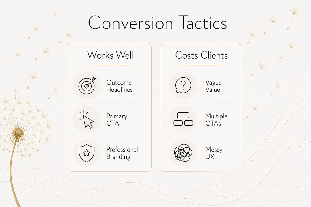
| What works | What costs you clients |
|---|---|
| Outcome-specific headlines | Vague value statements |
| One primary CTA per page | Multiple competing CTAs |
| Client logos and testimonials above the fold | Social proof buried at the bottom |
| Streamlined navigation with 5 or fewer menu items | Cluttered menus with 10+ links |
| Mobile-optimized layout | Desktop-only design |
| Specific case study results | Generic project descriptions |
Professional branding combined with streamlined user experience builds trust and reduces visitor friction. Branding consistency across your homepage, service pages, and About page signals that you are organized and credible. A site that looks different on every page creates subconscious doubt.
Navigation deserves specific attention. A consulting site with more than five menu items forces visitors to make too many decisions. Keep it simple: Home, Services, Case Studies, About, and Contact. Every additional page you add should earn its place by serving a specific visitor need.
Common pitfalls to avoid:
- Writing about your process instead of your client’s outcome
- Using stock photos that look nothing like your actual work
- Hiding your pricing philosophy entirely, which creates uncertainty
- Missing a mobile-optimized layout, since most first visits now happen on a phone
Key takeaways
Consultant websites convert clients by combining clear expertise signals, specific proof of results, and frictionless next steps into a site that functions as a continuous sales system.
| Point | Details |
|---|---|
| Case studies convert best | Structure each case study with situation, challenge, approach, and measurable result. |
| Service pages need outcomes | State exactly what clients get, who it is for, and what changes after working with you. |
| About pages need specifics | Name industries, credentials, and measurable experience rather than vague claims. |
| Low-commitment CTAs work | Free discovery calls and downloadable resources keep uncertain prospects engaged. |
| Design reduces friction | Five or fewer menu items, one CTA per page, and mobile-first layout increase inquiries. |
What I have learned about consultant websites after years of building them
The most common mistake I see on consultant websites is that they describe the consultant instead of the client’s problem. The homepage talks about the consultant’s background, methodology, and values. The visitor, who arrived with a specific problem in mind, reads three paragraphs and leaves because nothing spoke directly to their situation.
The fix is not a redesign. It is a rewrite. Lead with the client’s pain point, then introduce your solution. Your credentials belong on the About page, not the homepage headline.
The second pattern I notice is that consultants treat their website as a finished product. They launch it, feel relieved, and stop touching it. A site that never changes gives repeat visitors nothing new to engage with. The consultants who consistently generate inquiries treat their site as a living tool. They add case studies after each engagement. They update their service pages when their offer evolves. They publish content that addresses the questions their prospects are actually asking.
The third thing I have observed is that the best-converting consultant sites are not the most beautiful ones. They are the clearest ones. A site built on Squarespace or Webflow with sharp messaging and two strong case studies will outperform a custom-designed site with vague copy every time. Clarity converts. Complexity confuses. If you want to build your online presence fast, start with your message, not your color palette.
— Christopher
How Moderatemurmurations helps consultants build sites that convert
Consultants who want a site that actually generates inquiries need more than a template. They need clear messaging, a structure built around case studies and discovery calls, and a design that reduces friction at every step.
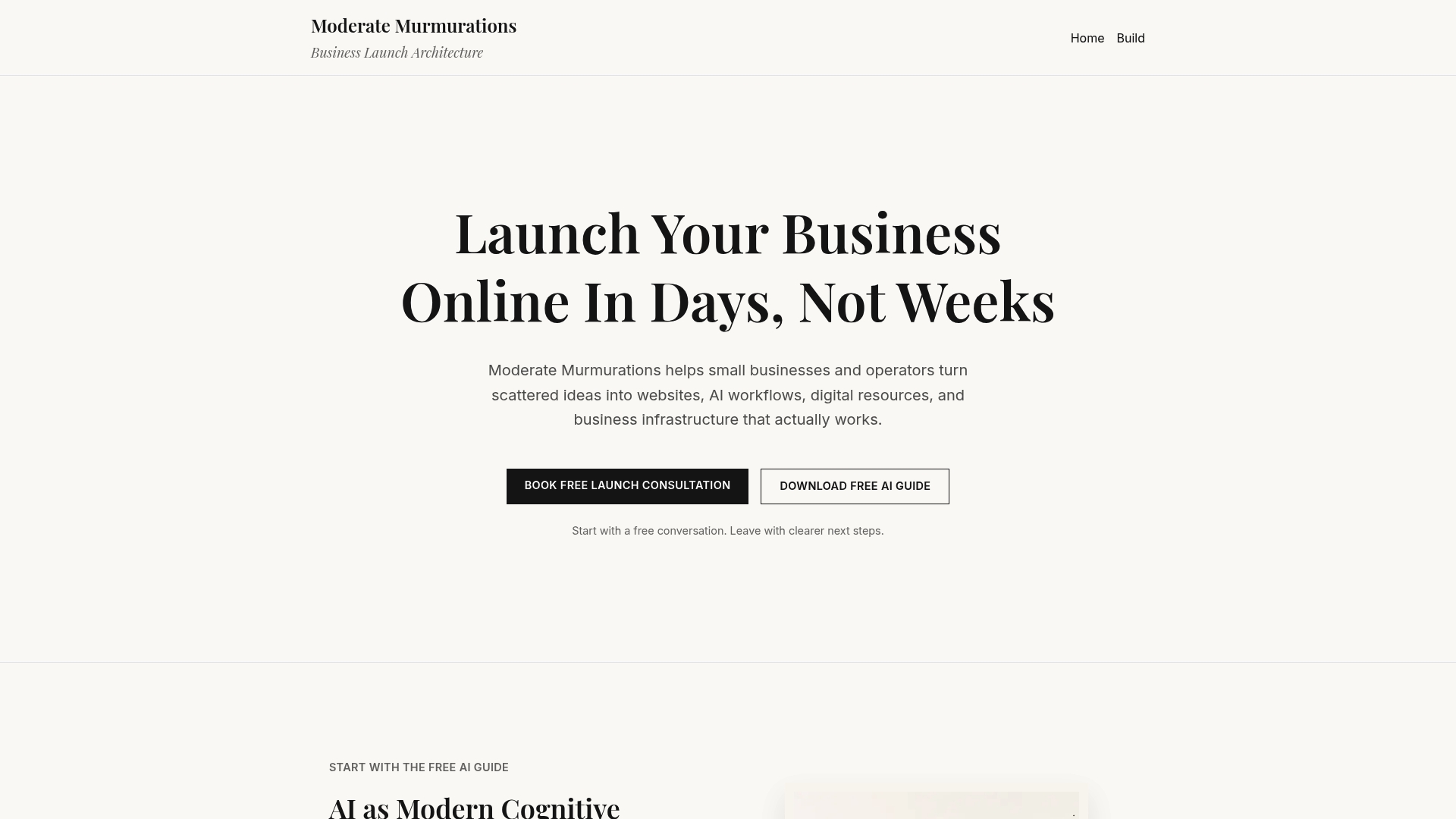
Moderatemurmurations builds fast, clean websites for consultants and service providers that are structured from the ground up for client conversion. We integrate case study sections, booking tools, and SEO foundations so your site works as a sales system, not a static page. Every project includes brand copy, clear service pages, and a digital structure built to grow with your practice. If you are ready to turn your website into a consistent source of client inquiries, see what we build or launch your presence with a team that understands how consulting clients make decisions.
FAQ
What is a consulting website designed to do?
A consulting website is designed to communicate expertise, build trust through proof of results, and guide visitors toward a low-friction next step like a discovery call or resource download.
Why do case studies convert better than testimonials?
Case studies provide specific situation, challenge, approach, and result narratives that create conviction. Testimonials create positive feelings but lack the detail that high-consideration buyers need to commit.
How many calls to action should a consulting website have?
Each page should have one primary call to action. Multiple competing CTAs create decision paralysis and reduce the likelihood that a visitor takes any action at all.
How often should a consultant update their website?
Add a new case study after each completed engagement and update service pages whenever your offer changes. Regular content like blog posts or guides gives repeat visitors a reason to return and builds SEO authority over time.
What makes a consulting website effective for attracting clients online?
Clear outcome-focused messaging, specific case studies, a detailed About page, and a visible low-commitment next step are the four elements that most directly drive client inquiries on consulting websites.